

 What is a subscription?
 Where the hell is the beautiful park-like city square they promised us from all those lovely conceptual drawings? Where is all the green they used so much to sell us on the changes to the Square? The square isn't that much different than it was before: lots of concrete and stone and very little shade. I call bullsh*t.
I started to rant about how they duped us and how the square hasn't changed much at all. But I decided to take a step back and look at the situation very closely.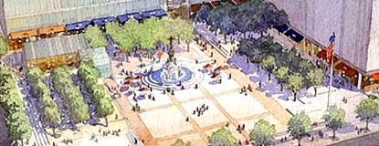 After further review, the final layout of the square is pretty close to the drawings. Granted the trees haven't filled out yet and the construction on the north end of the square isn't done, however, the drawings are on target with what the square is shaping up to be. But let's take a close look at those original drawings.
 Notice that in every drawing there's a lot of greenery, particularly trees. It gives the impression that the square will be more park-like. Every angle drawn is chosen to convey a idyllic setting, not an urban landscape.
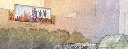 Now I'm not saying this was a great conspiracy. But, there was definitely a sales pitch going on here. That's what designers (architects, landscapers, etc.) do with conceptual drawings: sell you on their design concept. Well, they certainly sold the square as a park. Just look at each drawing - green, green, green.
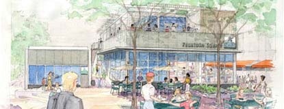 The drawings also show lots of shade. Now that doesn't mean they're incorrect. When I first saw the newly-opened square, I thought, where's all the green? The shade? Well, that was winter, and now it's summer and I'm still saying, where the hell is the green? One could argue that the trees haven't filled out yet, and that all the flower boxes aren't in - but look at all the concept pictures: way more shade than those trees will ever create - and I believe more trees than were planted.
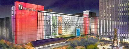 Also take note of the fact that in every drawing greenery is used to cover up a stark urban streetscape, even in the periphery. Look at the drawing of the new facade on the 5/3 garage. This is the most urban of all the illustrations, and even this has the edges softened with trees.
So I come to the end of this rant with a mixed reading on the meter. On one hand, it's apparent that their drawings were designed to conjure a certain feeling. On the other hand, they're not entirely inaccurate. But I - and everyone else I've talked to - feel that we've had yet another architectural bait and switch pulled on us. They do it all the time in Cincy: the Accent, the CAC, Great American Ballpark, just to name a few.
But in this case, I have to say that their bullsh*t was spread on our crackers with such delicate precision that we gobbled it up without closer inspection. And for that, we, the enthusiastic supporters of the new square concept, are to blame as well. However this bullsh*t was of such fine caliber that they definitely had a solid reading on the meter, and thus this week's award.
Wednesday, June 27, 2007
BSM: Fountain Square
Filed under:
bullsh*t,
development,
fountain square
![]()
![]()
![]()
![]()
![]()
![]()
![]()
![]()
![]()
![]()
![]()
![]()
Subscribe to:
Post Comments (Atom)


0 Comments:
Post a Comment